
Low-/No-code data platforms: wrap-up and pros and cons overview | Sharing the data workflow
How do Dataiku, C3.ai's ExMachina, Sagemaker, Snowflake, Quicksight and Gooddata join datasets, modify/enrich data, train a machine learning model, access and store data and create visualization graphs. With videos.
I have to own up to the fact that I won't be able to complete the Low/No-Code data platforms reviews in the way that I started it, with demos of real data manipulation using a specific data goal, and taking you through this whole process. I have too much going on for now and it will take me far too long to complete such a video series.
I did however do the evaluation and processed this data using these platforms, and have hours of rushes of this process. But I don't have the time to go through them and edit a set of videos right now.
I decided to just do one wrap-up post with my high level comparison of the platforms and conclusions, but with only limited evidence footage, and without the focus on the multitude of specific tasks that I did: joins, merges, cleanups, formatting, enrichment and so on.
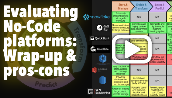
First of all, here are the high-level findings:

In the video below, I go through the various platforms and their strengths and weaknesses and tell you what I consider the best suite to do a No-Code data science project, how I got to this table above.
Below I'm also posting some key sequences that may help better contextualize the statements that I make in the video.
I'll take the key examples of joining datasets, modifying/enriching data, creating a machine learning model and visualization, and show you how it's done in Dataiku, C3.AI's ExMachina, Sagemaker and Gooddata.
Join in Dataiku + Snowflake:
Once you have your whole data, in whatever shape, in Snowflake, then Dataiku can take over and enrich it no end. But Dataiku is no help in getting the data into Snowflake. I had to use ExMachina for that.
Join in C3.ai's Ex Machina:
When I had figured it out and after I had to restart the environment a couple of times when these useless errors occurred, the ability to join and to push data to Snowflake was really useful and seamless. In fact, going through ExMachina is the only way I had to load 1.5M records from local CSV into Snowflake completely No-Code. Snowflake has a load wizard for small datasets, but to load large ones, I would have had to split them, put them into a staging area, then run some code to create the tables and so on from there. All this would have required me to code. No doubt for a dev it's trivial work, but for someone who's only interested in getting data up and running and is not a developer, it would have been a real hassle.
And in real business life, requiring someone else to do a task, however trivial, breaks the flow of productivity and places constraints on your organizational strategy.
"Join" in GoodData:
I attempted to take my separate datasets and use global country and date measures to connect (ie "join") them to be able to use the shared attributes to graph the measures. I spent a lot of time on this. This video highlights in one minute the logic of what I tried to do. It didn't work. It could be that I didn't understand the proper way to do something like this in GoodData, and I didn't reach out to the support to find out. They did reach out to me a couple of time to ask if I had questions, but I didn't manage to make the time for it.
I eventually used the dataset that I had previously processed, joined and aggregated, in order to be able to graph it nicely in GoodData.
Visualize in GoodData:
Visualization is GoodData's clear sweet spot. Creating graphs and dashboards is a breeze and very user friendly. I find it even more user-friendly in Quicksight, but the difference is minimal and I didn't capture my Quicksight sessions. But it's roughly the same.
Visualize in Dataiku:
Dataiku has a very good and very well-integrated visualization UX, although the micro-UX features are more rudimentary and less flexible in Dataiku than in GoodData. In particular, filtering on one hand, and coloring on the other, are too much of a drag in Dataiku. It's not a show-stopper at all, but it will take significantly more clicks and hassle to filter data and to configure the graph colors in Dataiku.
Visualize in Ex Machina:
Ex Machina has an absolutely insane graph configuration UX. First, graph series have to be manually and individually constructed explicitly using filters on the values in the dataset, which means that just creating a graph requires an excruciatingly frustrating amount of clicks and configurations during which there is no visual feedback on what the graph looks like; but second, once you have created your series in one type of chart, for instance a line chart, and you want to see what it looks like in a bar chart, you have to start from scratch again! Not to mention that the variety of chart types available is far too limited. In other words, graphing data in Ex Machina is just unusable. It's a real shame, given that seeing the data is the main use case of the regular No-Code user, who is Ex Machina's core target user.
Dashboards in GoodData and Dataiku:
Both GoodData and Dataiku have a very similar dashboard UX. It's simple and pretty straightfroward to use. I did get a little confused by the logic for saving and updating dashboard in GoodData, but that's anecdotal.
Process data and visualize in Sagemaker:
Sagemaker has created a pipeline-like UX that is somewhere in the middle between Dataiku and C3.ai's Ex Machina. I'd say lost somewhere in between. It's neither a simple canvas with nodes like Ex Machina on which you perform clear actions with datasets, neither a pipeline of configurable recipes. It has a UX with a meaningless tab structure that changes the behavior of the double-click on the objects on the canvas, the core object on the canvas is neither a dataset nor a process, it's an unclear mix of the two, and it opens on a long list of obscure action categories that unfold to some fields that you have to fill out. The categories have jargony names, such that if you want to do something specific, there's no way to know in what category the action you're interested in is going to be. It's a horrible tool for a non-dev user who wants to discover, transform and visualize their data.
Cleanup and format data in Dataiku using recipes:
Dataiku's sweet spot is how it helps you manipulate and visualize your data in real time as you do things to it. There's nothing else like it that I've seen. It also leverages in-database compute extremely easily and clearly. In this video I illustrate how it does that.
Enrich a dataset and train a machine-learning model in Dataiku:
Dataiku on one hand makes it very easy to enrich your data using simple formulae or dedicated UX for specific enrichments. In this video, I start by adding a set of columns with a number of days of delay for the onset of epidemiological outcomes compared to the date of tweets about Covid, with the idea of seeing whether there is a leading relationship between tweets about Covid and the actual evolution of the epidemic. I did use this data to train a model, but that video is very long and complicated, and I prefer to use simpler footage for this short exposition.
For the sake of simplicity, then, I show you on another dataset how training a model works. I scroll through the various features of analysis of a trained model, although in this video I don't have a clear training goal, it's just exploratory.
Dataiku has substantially more features to configure and visualize a training model, machine learning or neural networks, and analyze the output. Each model has specific visualizations and parameters, of course.
The beauty of Dataiku is that they have dedicated UX for every data goal. It's not a UI template that just picks up fields from output data, it's specific to each model type.
You can see how the Random Forrest model visualization is different from the Ridge one in this video.
Conclusion
I hope that this overview helped you orient yourself in the sort of options available if you want to do no-code data projects. There are other platforms out there that I didn't review. If you have a favorite one that brings something to the table that is not covered here, or if you know one of the platforms that I reviewed and disagree with my quick assessment, let me know here or on LinkedIn and I'll definitely take a look and make an updated post if I think it's worth it.
Happy data wrangling.
Comments